
Actionable analytics based on 10M+ analysed sessions for 400+ business landing pages
cl1ck.ai(YC China S22) is an Analytics Dashboard that measures website performance and extracts actionable insights for small business owners. As a sole designer at cl1ck.ai, I designed solutions and experiences from the perspective spanning across user needs, branding positioning, growth marketing, and so much more.
Overview
Duration
1.5 years
Team
Binay Gurung
Christy Sze
Dickson Chow
Monesh Lalwani
Ryan Wan
Titiksha Tolia
Ayumi Lee
Tools
Competitive evaluation
Contextual inquiry
Card sorting
Information architecture
Rapid prototyping
High-fidelity prototype
Moderated usability testing
Platform
SAAS

cl1ck.ai started as a digital marketing agency, R3A
R3A, a marketing agency discovered despite their successful ad, visitors dropped off on clients’ sales websites. These businesses, under limited capital and resources, generally do not have a good idea of improving their websites utilizing website analytics, so R3A began to wonder if there is an untapped market, which ultimately forms the foundation of cl1ck.ai.

Upon talking to business owners in SME conferences, I identified design opportunities to spotlight outliers and simplify metrics
As a novice in marketing analytics, I conducted contextual inquiry by attending numerous SME conferences in Hong Kong and engage with business owners who are keen on enhancing their digital presence.
Most of the conversations surround discussing current usability issues found in existing data analytics platform, accessing their data literacy level, and collecting relevant metrics that can serve their needs. These metrics were later used for conducting card sorting exercises to further understand user's mental model.
Key insights from contextual interviews
SMEs are not looking for averages.
They want outliers, glaring issues, and unexpected user behavior so they can spot them immediately and fix it.
Current data analytics platforms overwhelm SMEs
They struggle to comprehend metrics and their relevance to business goals, resulting in significant time spent filtering and identifying unexpected user behavior.
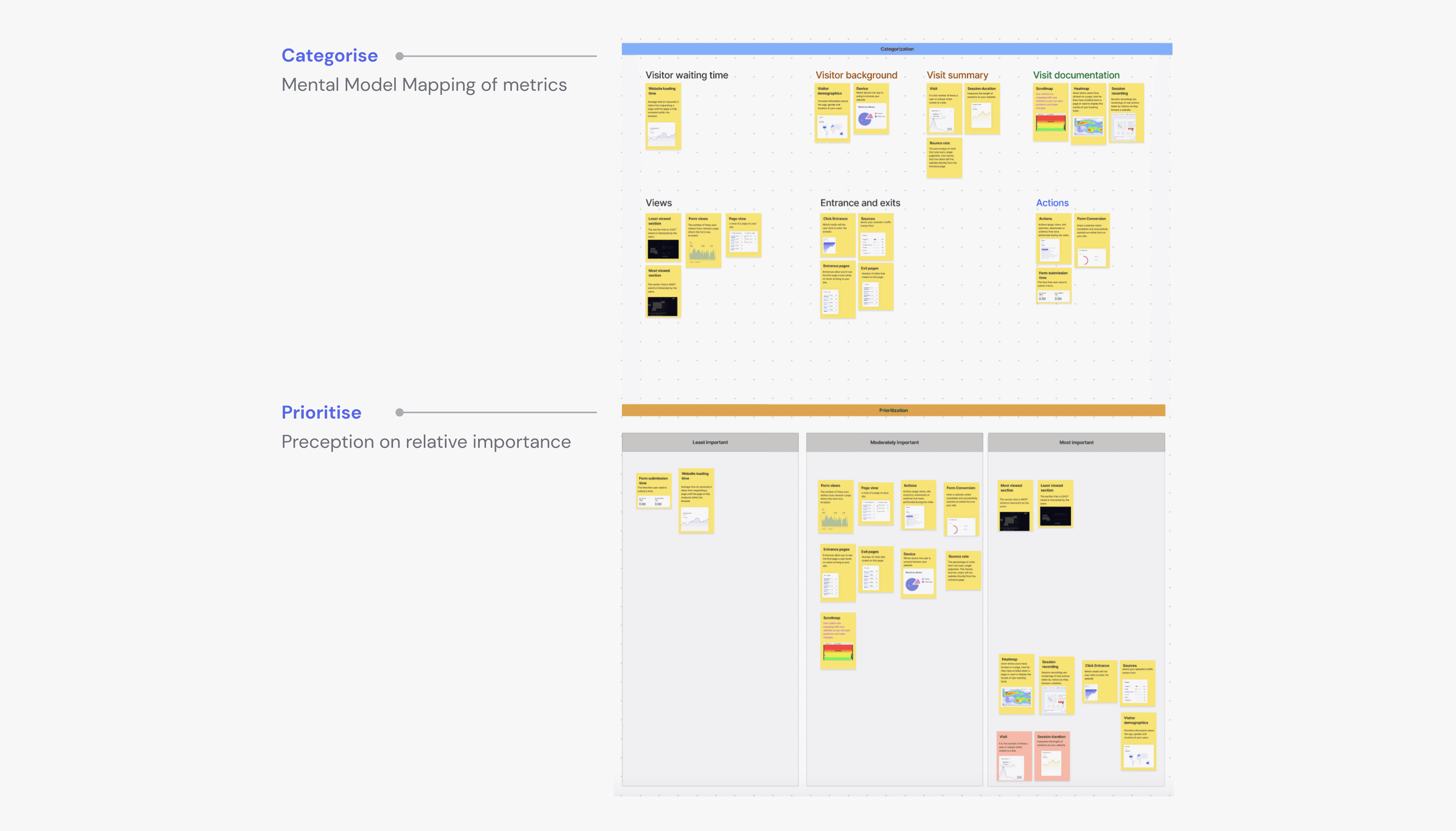
Interviewees organise metrics based on viewer actions with discrepancies in data Tracking preferences
I curated a set of key metrics that interviewees deemed vital for driving business performance. In a follow-up card sorting session, I had them categorize these metrics to unveil their mental models and prioritize them based on importance.
I learned that users categorize based on viewers' actions, not component nature, as seen in preferences for terms like "Things Visitors Viewed" over specific analytics labels. Another revelation I had was interviewees, despite stating high value for qualitative data like heatmaps, didn't track them when demonstrating interaction with current data tracking platforms. There seems to be a gap between actionable insights and qualitative analytics.
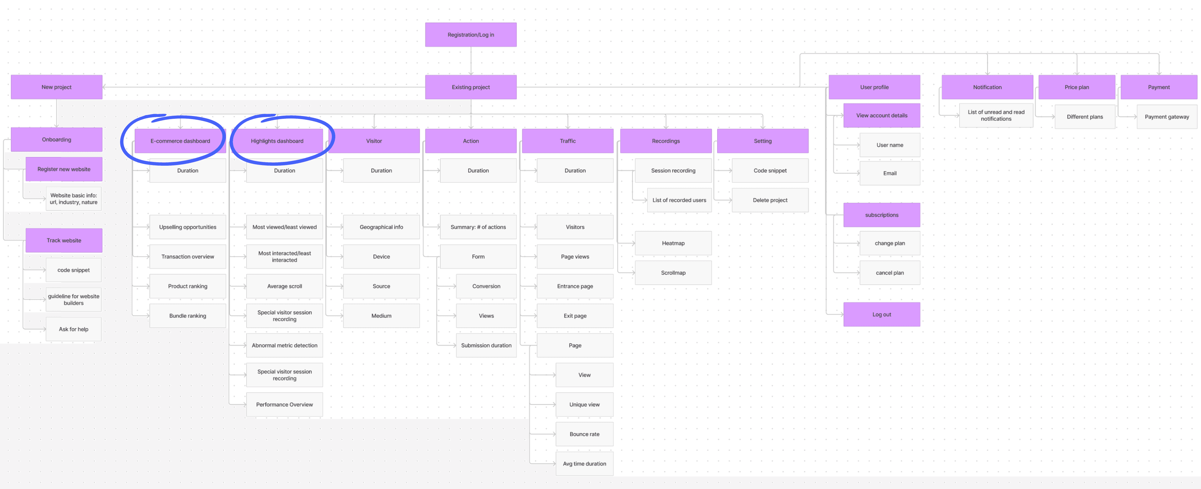
Tailoring Information Architecture to daily sales decisions and spotting outliers
I later built an information architecture with full-stack engineers tailored to users' expectations. Recognizing users' daily sales decisions, like setting discounts and bundling campaigns, we established a dedicated e-commerce section addressing their business queries. Automation of product bundling and upselling analysis distinguishes our approach, streamlining the process compared to existing platforms relying on custom analytics, where users often manually construct and filter these analyses.
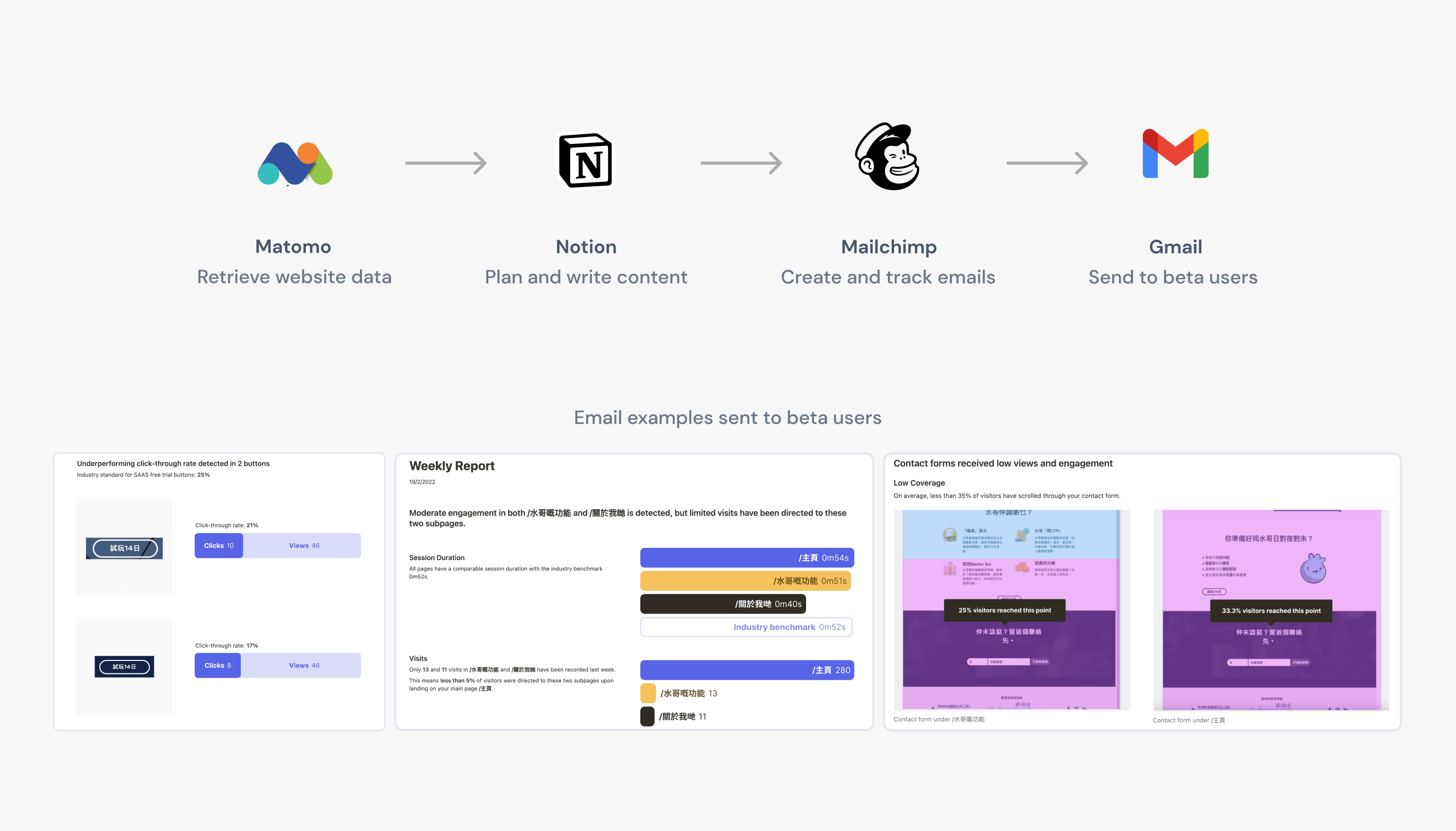
Accelerating iteration cycles with no-code rapid prototyping
To identify users' preferred actionable insights, we conducted swift experiments by sending weekly, personalized emails to 13 beta testers. These emails, focusing on conversion, engagement, and lead generation, provided insights extracted through pre-analysis of their websites using Matomo. We then used notion to document areas of high drop-off, evaluated signup form engagement, and assessed CTA button clickthrough rates before sending them to beta users.
To gauge interest in specific insight, we included a "Receive more analysis like this" button alongside each curated insight. Analyzing the clickthrough rates of these buttons allowed us to determine their relevance to users.
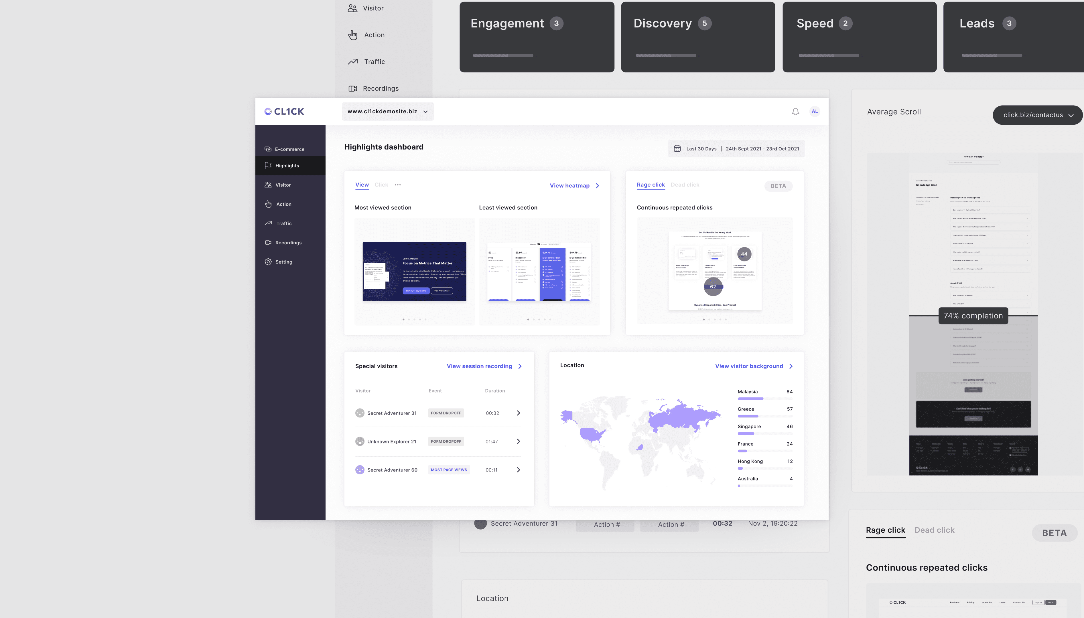
Highlighting user actions: an highlight dashboard for unanticipated behaviors
To meet user needs for unexpected behaviors, we crafted a highlights dashboard featuring outliers such as special visitor session clips, most/least interacted sections, dead clicks, and more.
Instead of showing full sessions of user recordings and heatmaps, cl1ck.ai extracted the most glaring user behaviors, like form dropoff and dedicated viewers, in the highlight dashboard so business owners can make data-driven decisions swiftly.
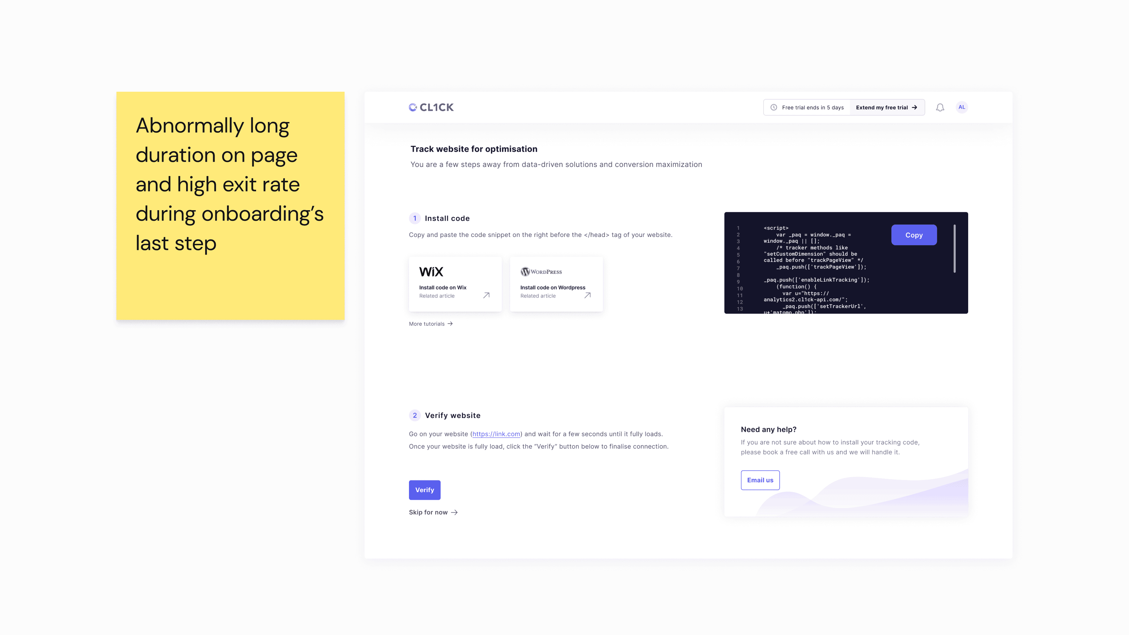
Users drop off during onboarding due to difficulty connecting their websites to cl1ck.ai
The most cognitive-demanding part of the whole onboarding processes is having users manually connect their website to cl1ck.ai. Users need to copy a code snippet and paste to their website codes.
Even though I included some guides for connecting cl1ck.ai with websites built on Wix and Wordpress, two popular website builder choices from our beta user groups, our team observed a high exit rate at the end of onboarding, indicating a signup bottleneck.

The exit rate remained high despite visual improvements and decluttering information
At first, I did a quick heuristic evaluation and believed the problem is a lack of hierarchy between visual elements, and an unnecessary emphasis on the code snippet's content.
I rearranged the visual elements virtually to align with the natural top-to-bottom reading pattern. I also intended to further encourage users to complete the whole signup process by letting them preview a demo project to build up expectations and excitement.
Nonetheless, the page exit rate remained high. I decided to conduct an moderated usability testing to find out why.

The issue: our user went straight into Inspect Element to install the code snippet
I realized instead of adding the tracking code within their website builders, our beta users went directly to their website and instead, opened the Inspect element to paste the code.This highlighted the importance of acknowledging that users may not always follow expected procedures, even with well-written documentation. We cannot assume users will patiently read through instructions to locate the code snippet placement.

Simplifying the onboarding experience with scenario-based treatments
Following the above-moderated usability testing, I streamlined the documentation selection process by asking users about their website builder early on, offering popular choices like Wix, WordPress, and Shopify. Then, I remove irrelevant information by displaying a side-by-side view of the respective video tutorial alongside corresponding instructions in CL1CK to improve learnabilty.

In the face of ambiguity, there's nothing left to do but try.
As fulfilling as the startup journey was, it had a lot of ups and downs, hopes and doubts. We pivoted several times trying to learn what online business owners need from us the most. We originally thought they needed a data-driven website builder that guides their website creation process, only to realize the building part was not the problem, but the latter analysis to drive sales.